
General: Icons and the real world
I’ve heard people lately discussing the Save icon and how it’s not relevant now. The Save icons that are a picture of a 3 1/2 inch floppy disk are basically meaningless today.
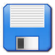
I did have to laugh when I heard a kid who saw a 3 1/2 inch floppy for the first time comment that someone had made “a physical save icon”. I suppose that’s how it seemed to him.
Even funnier, is that I read on Facebook today that Japanese kids were discussing why the Save icon in Excel was a picture of a vending machine with a can of drink ejected at the bottom. That’s so good !
But then it occurred to me that so many of the icons we use in today’s operating systems are in the same situation.
Even book icons will probably lose meaning over time. That’ll apply to book icons for dictionaries and thesauruses too.

Phone icons are already pretty odd as many kids would never have seen a phone that looks like those icons.

The open icons are often manilla folders. They still have some life left in them but not much. How many people use manilla folders today?

There are still some clipboards around but not many.

Video icons that show sprocket holes each side of a film are basically meaningless.

All the mail, email, mail merge, etc. icons that show letters are fast becoming meaningless. (Ask our mail services about that) And adhesive labels?


Even recent versions of the Office suite have old style lightbulbs for ideas. At least there are some LED based lightbulbs that still look like that. But for how long?

The slideshow icon in PowerPoint is an old style roll-up projector screen. And it’s timing icons are all analog clocks (limited lifespan). It’s screenshot icons are cameras that very few kids would recognize.


And so on and so on. I wonder how long it will be before many of the icons that were designed to represent common physical things will lose all their physical equivalence.
Does that then make it harder for newcomers to computing to recognize anything?
2025-11-16